BBC

Topsy and Tim

We ran this game a little differently as an experiment into collaboration.

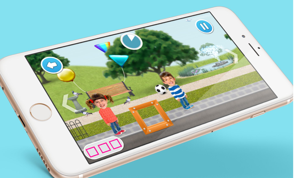
I produced the Game Design Document before agreeing on an Art Style with the programme owners, building on a previous Topsy and Tim game style. I was keen to explore pillars of free play and variable reward as the game itself hinges on the main map that houses multiple mini-games.

The opportunity

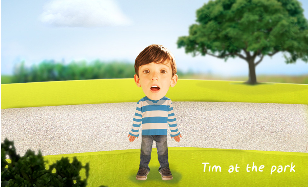
Topsy and Tim was a key brand for CBeebies. The challenge was how to make a game based on real-life that felt fun for children. It may sound simple but previous games had struggled.

THE TEAM

Robin Gibson (Snr Designer)

AGENCY

Player Three (Design and Development)

MY ROLE

Game concept and game designer from discovery to delivery

UX Design

Game Design

Concept

Art direction

TIMELINE

March 2016
November 2016

LINKS

Our Approach

Having two children certainly helped with the conceptual thinking on this game as I regularly read the Topsy and Tim books to my children at night.

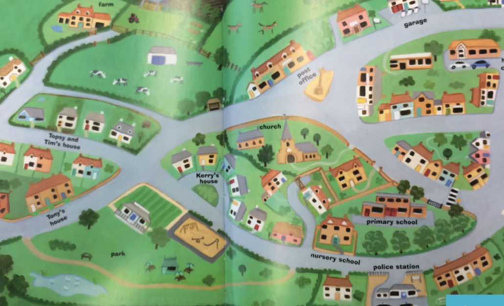
The books feature a map of the town in which the children live and my son loved drawing his finger around the map as if he was a car.

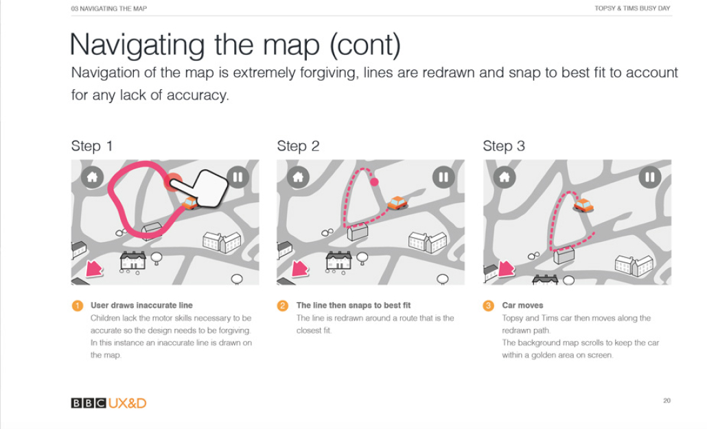
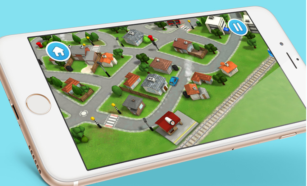
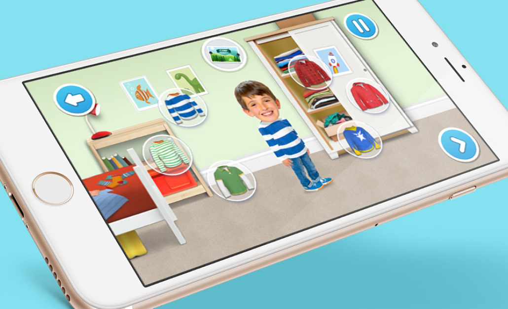
This simple concept gave me the idea to develop the main menu as an interactive toy where the user could draw any route on the map and the car would follow.

Source of inspiration - I read the Topsy and Tim stories to my children and they loved drawing their finger over the roads as if driving.
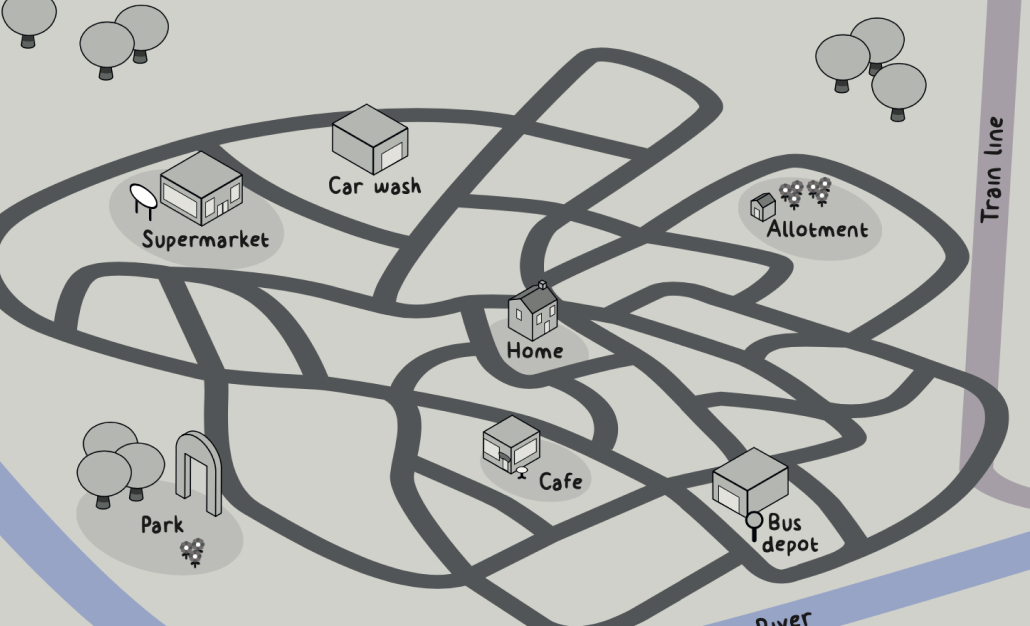
Game map with key scenarios at each location.

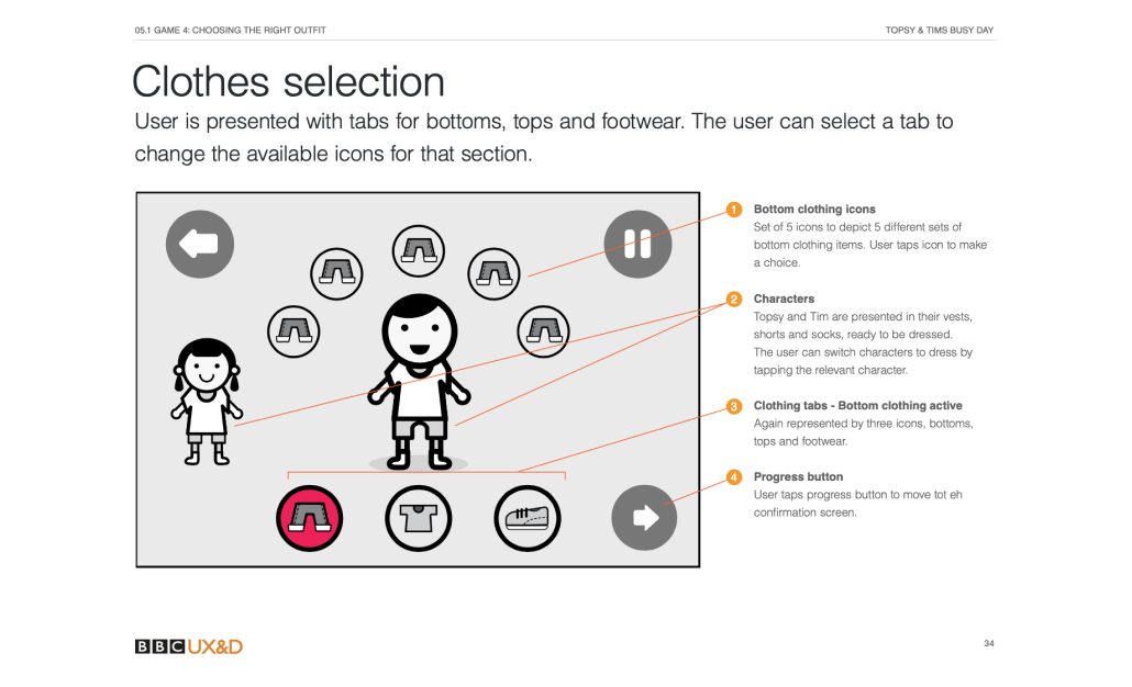
We pitched this to the game's producers and I was given the green light to produce an extensive games bible outlining a series of mini-games. This formed part of a tender process and we got agencies to pitch on producing the game which I would lead from a design and gameplay perspective.

Working with games agencies was more waterfall than I was used to and finding ways to create a compelling game without a huge scope or budget was challenging. It is to Player Three's credit that they took these ideas and built on them, pushing back where it was needed to ensure the project stayed within the realms of reality.

The core mechanic itself focussed on the map element. We did multiple iterations to get the interaction just right. Our target market was four-year-olds so it had to be forgiving in design.

We extensively user-tested this game with children, as was the same with all games produced at the BBC.

When it was launched the game rapidly became the most successful game within Playtime based on stats. I often still see reviews asking for it back as it was held within the old Playtime app.

Player Three and our team at the BBC delivered an outstanding game full of moments of real joy.

THE TEAM

Robin Gibson (Snr Designer)

AGENCY

Player Three (Design and Development)

MY ROLE

Game concept and game designer from discovery to delivery

UX Design

Game Design

Concept

Art direction

TIMELINE

March 2016
November 2016

LINKS