BBC
Children's Design Principles
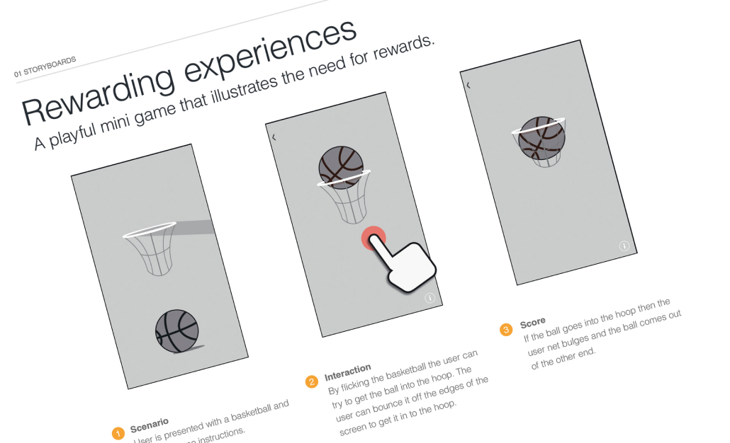
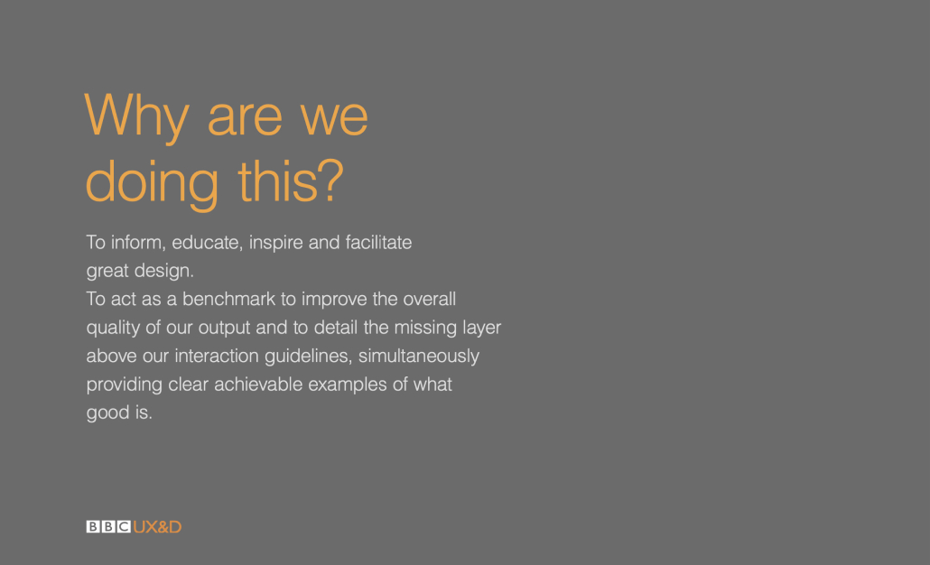
One of the first things I noticed when I joined the Children's design team was that we had lots of guidelines for the positioning of elements on screen but nothing about the emotional layer that makes kids want to come back to our games and apps.
It felt like we were creating empty rooms where the light switches would be in a consistent place, or the plug sockets would be positioned in similar places.
It didn’t tell you what to fill the room with to create a space that kids want to stay and have fun in…. like should a bed be bouncy, should the clock shoot out of the wall.
The problem
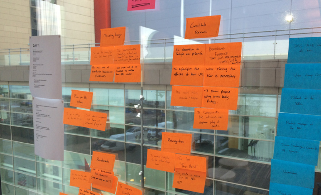
What we found as a design team on games and apps is that when we were feeding back on work, fairly consistent themes would appear which would force us to repeat ourselves as we fed back.
The themes were generally difficult concepts to easily communicate to both designers and non-designers alike.
THE TEAM
Robin Gibson (Snr Designer)
Andy Campbell (Mid Designer)
Joe Maguire (Mid Designer)
THE AGENCY
Complete Control
MY ROLE
I conceptulised the project and organised a team to back me.

Team lead

Strategy

Visual design

Research

Workshop facilitation
TIMELINE


