BBC

iPlayer Kids

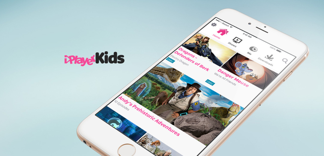
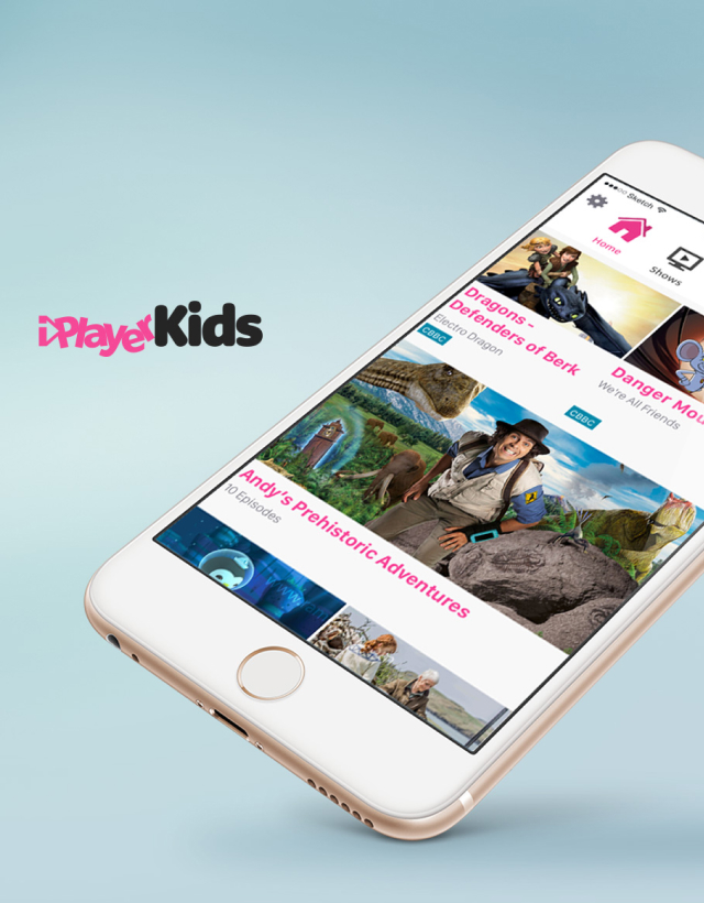
A rapid and lean UX project, the iPlayer kids app was turned around from concept to app store within 6 months.

There had always been discussions within the BBC about whether or not there should be a separate experience for kids in iPlayer but the truth is it took getting wind of Sky releasing a kids version of their app for the Beeb to get going.

The problem

We were given a very short time frame to discover what the minimum we could do to iPlayer to make it child friendly.

There was no scope to create a brand new app from the ground up. We had to pick our battles and pick them well.

THE TEAM

Robin Gibson (Snr Designer)
Wez Elliott (Snr Designer)
Suzanne Clarke (Mid Designer)

MY ROLE

I worked from concept and discovery to finished product

Team lead

Strategy

UX Design

Research

Workshop facilitation

TIMELINE

September 2015
March 2016

LINKS

Our Approach

Once the project was given the green light we had to work extremely fast.

Strategically, it was important that we launched rapidly but as with all new products, the earlier we could get it in the hands of the audience the sooner we could start to learn.

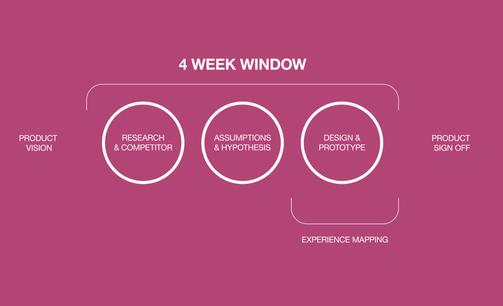
Initially, we looked at competitor apps as well as the existing iPlayer app. Some of the big challenges we faced were trying to ensure we created a design that would be as appealing to a 5-year-old as a 9-year-old. Our standpoint was that we would only change designs where there was a barrier to children. This would ensure that we only developed features necessary for the audience as an MVP.

We created experience maps based on our children's personas, looking at potential problems for our users.
Early concept sketch for tabbed navigation

I have a large amount of experience testing with children so we rapidly made a prototype based on our assumptions of what would and wouldn't be challenging for children to do.

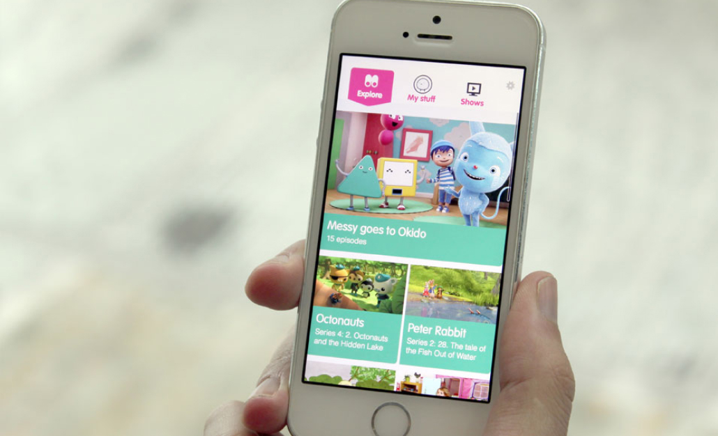
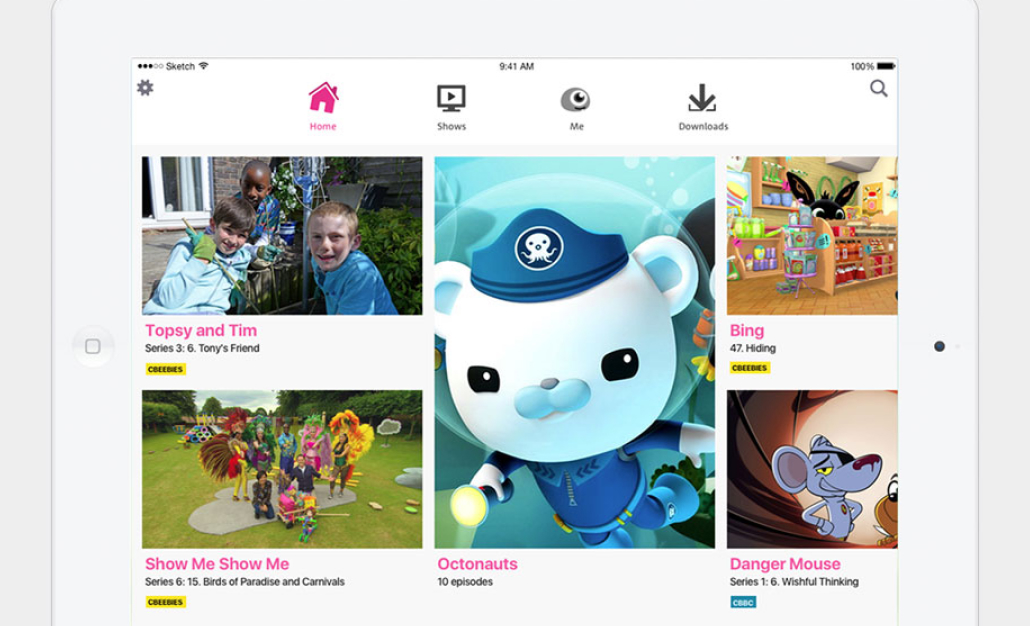
One of the biggest changes to the iPlayer design was our assumption that children would find an exposed navigation easier to navigate as opposed to the drawer mechanism that is currently in the main iPlayer.

Lab research gave us evidence to share with the product team that to make the product viable we needed to make a significant change to the primary navigation.

Assumptions are there to be shot down. I didn't believe search was needed, thinking it would be too complex and off-putting but I was wrong.

Looking at the data on the website, search was frequently used. During testing this was further validated, children as young as 5 were typing into text boxes to search for programmes, and this became the primary discovery mechanism.

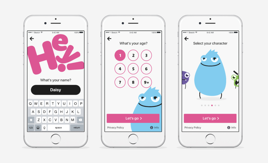
Due to the rapid nature of the project, it was felt necessary to bring Moving Brands in to help formulate the branding and avatars whilst the internal team focussed on the UX and visual design of the app.

Although challenging due to the pace, the number of stakeholders and third party branding, iPlayer Kids came together brilliantly.

A huge success so far for the BBC.

THE TEAM

Robin Gibson (Snr Designer)
Wez Elliott (Snr Designer)
Suzanne Clarke (Mid Designer)

MY ROLE

I worked from concept and discovery to finished product

Team lead

Strategy

UX Design

Illustration

Research

Workshop facilitation

TIMELINE

April 2017
April 2019

LINKS