MANCHESTER CITY

New iOS and Android app

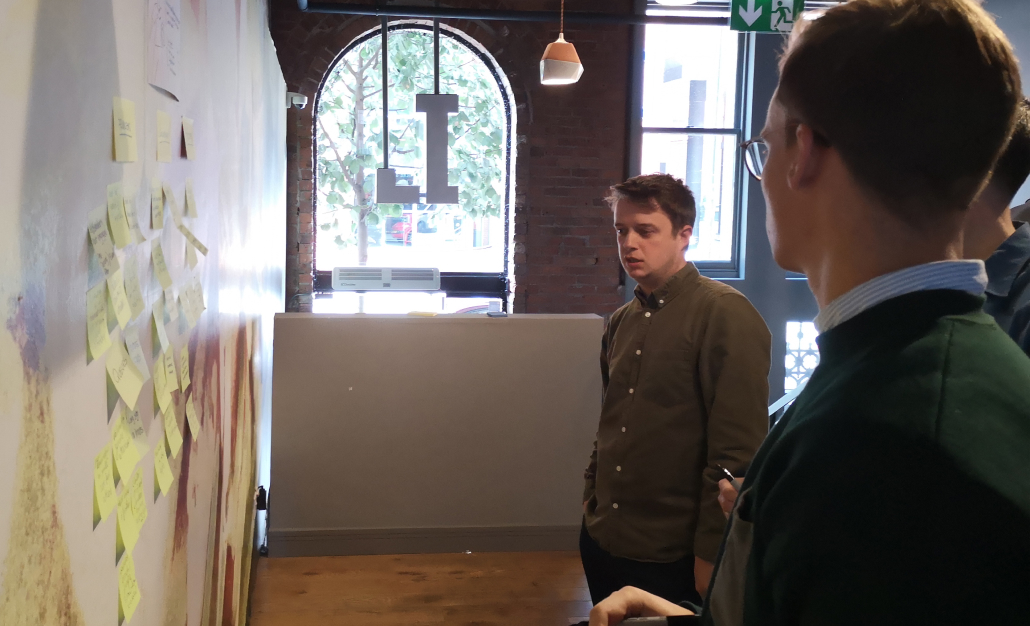
I'd worked with Andy at the BBC and he asked me to come to help out with the workload for Man City.

The team had done some early definition and discovery of a new app and wanted me to lead the design during the delivery phase.

The problem

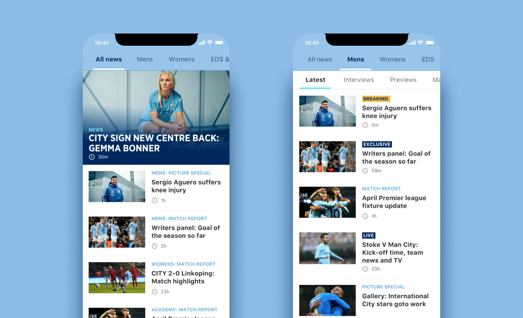
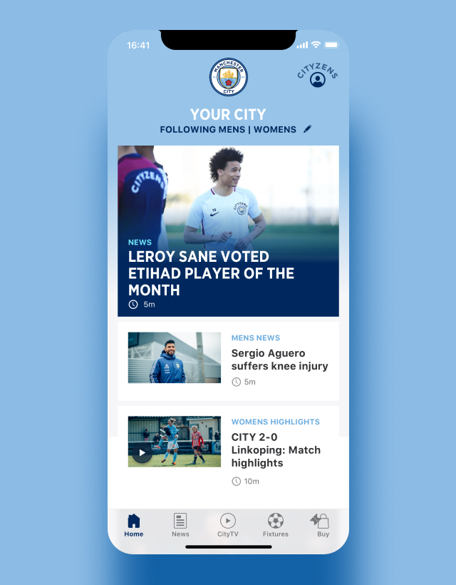
At the time I joined, City had two apps already in the stores. A match-day app and a City news app. The match-day app only worked on match-days and the news app had been built with quite a bespoke UI and not many native patterns. Both apps suffered from frequent bugs, glitches and poor review app store reviews.
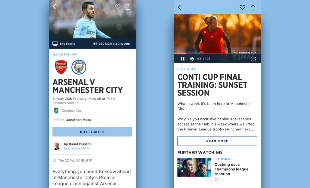
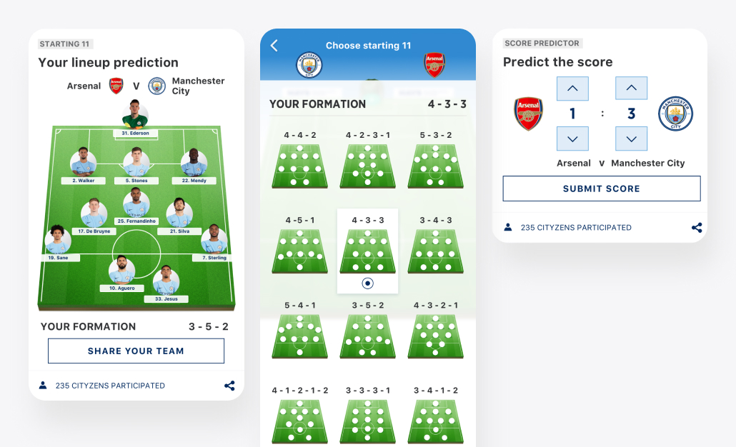
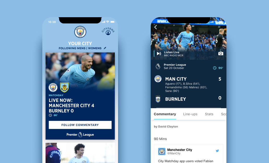
THE TEAM

Andy Myers (Snr Designer)
Robin Gibson (Snr Designer)

MY ROLE

I worked from development to finished product

Strategy

UX Design

UI Design

Research

TIMELINE

February 2018
January 2019

LINKS

Our Approach

The team wanted to pull together both of these apps into one, utilise more standard native patterns and combine the women's team news into the app.

Some exploration had taken place and Andy (who was covering responsive web and tickets) had done a brilliant job in setting the early vision. I got to know the product team (all super nice) and set about looking at the potential architecture of the app. There was a huge amount of information available, news for all the City teams (men's, women's and academy), behind the scenes, video, fan zones, tickets, shop and more.

Myself and Andy ran regular workshops with the wider team to ensure we got alignment

I did some competitor analysis and looked at other apps which were handling large amounts of information and how they did it. It was clear we would need a large news section but everything else was up for grabs.

I worked very closely with Matt (Product owner) and we sketched various groupings of content out. It helped that Matt was a huge City fan, his knowledge of what was available was second to none. He also showed very good judgement with what he felt fans would want. We would validate this later with research but his experience and passion got us on the right track quickly.

I had loads of fun with the matchday widgets which would appear on the homescreen at relevant points.

I explored the initial iterations of a horizontal scrolling menu. This approach would become the bedrock of the app. Allowing us to surface huge amounts of information in an easily understandable way. This gave us one part of the solution but we had the match-day issue to solve. How should the app flex to reflect a live event?

We explored the concept of a dynamic home screen. The intention was that "cards" would be displayed at timely and relevant points. During a match, promos to the Match-day centre would be shown, where you could listen, follow text commentary or watch the match. These promos provided takeover moments of the home screen but you could still access all the news and videos in the other sections or by scrolling down the home stream. As a principle, this seemed to work well but we still had the challenge of how to accommodate different team interests on the home screen. We wanted to provide the women's team with as big a platform as the men's team but we had to identify how to manage those times when the information for both teams would compete with each other. The truth is that not everyone is interested in both teams and/or the academy.

One potential solution amongst others was that we would provide the option to customise your home screen as part of the onboarding. A simple screen to identify the news you wanted to receive on the homepage.

Customisation is problematic, previous experience shows that users are unlikely to spend a long time setting up a page to their liking. So we put a simple engaging screen as part of onboarding... "Choose the teams you want to follow."

By having this choice upfront we gave the women's team an equal platform as the men's. It would be up to the user to decide how they set up their home stream, Men's, Women's, Academy or all.

City used a lot of agencies for work so having design in-house helped us to introduce more qualitative research. I had used a similar technique at Zuto when there wasn't the budget available to arrange user research.

We created our own lab using three cameras, screen recording software and an empty meeting room.

I spoke to a recruitment agency and got 6 users available for a lab session. We had no lab no budget to pay for it so between me and Andy we set up our own. Three webcams, screen recording software and mics were all used.

We set our research objectives and began running the sessions. I'm aware of the dangers of confirmation bias so arranged for the in-house marketing research team to facilitate the sessions. This was the first time they'd been exposed to UX research and they all seemed to thoroughly enjoy it.

With this approach, we were able to save a lot of money which meant we had more money to run more sessions. We did this throughout the lifecycle of the project to great success. The product team loved seeing some of their ideas come to life and get that instant feedback from users.

We would share the output of the lab sessions with the wider stakeholder group.

We produced all the designs in Sketch and supplied these in Zeplin to the offshore development team. I worked closely with them to ensure everything matched our specs and designs.

The project was a great success, the app store reviews are up massively (4.5 last time I looked), the team now have a much more stable platform, one app to maintain instead of two and we achieved a goal of giving equal prominence to the women's team.

I worked on other projects at City which I'm sure I'll write up about soon but my time there was brilliant and I certainly miss the catchups with everyone.

Example of how the home screen flexes on match-day to show a link to the live match commentary.

THE TEAM

Andy Myers (Snr Designer)
Robin Gibson (Snr Designer)

MY ROLE

I worked from development to finished product

Strategy

UX Design

UI Design

Research

TIMELINE

February 2018
January 2019

LINKS