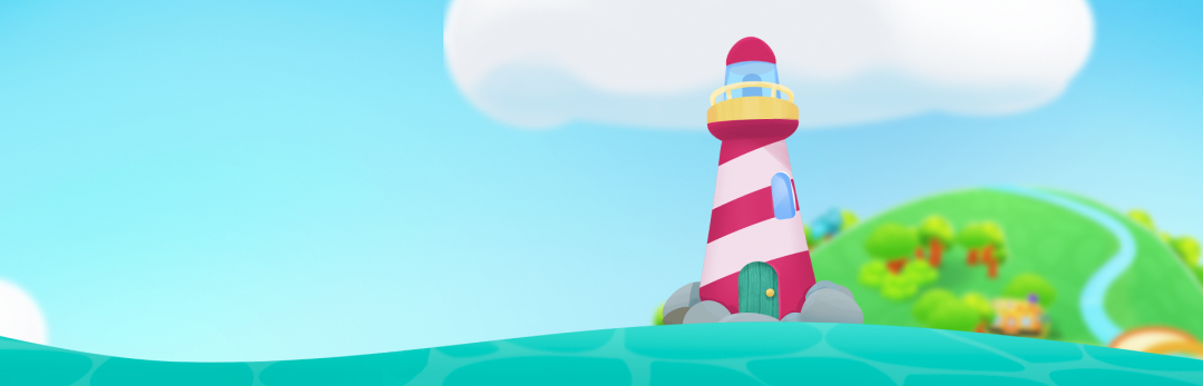
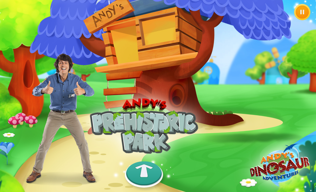
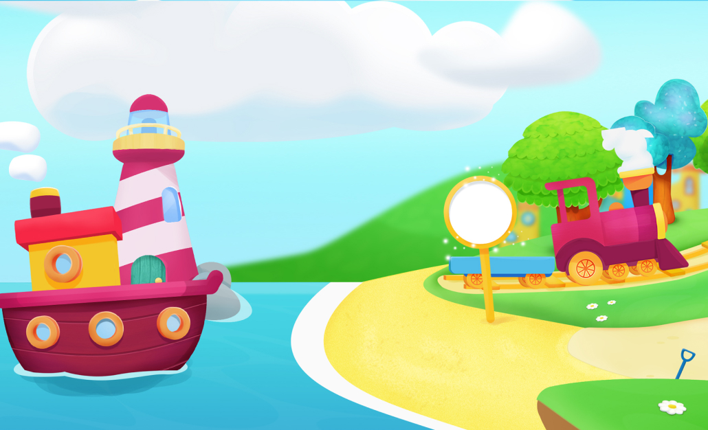
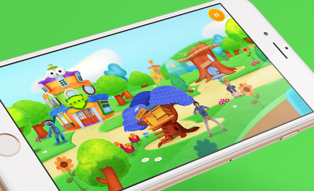
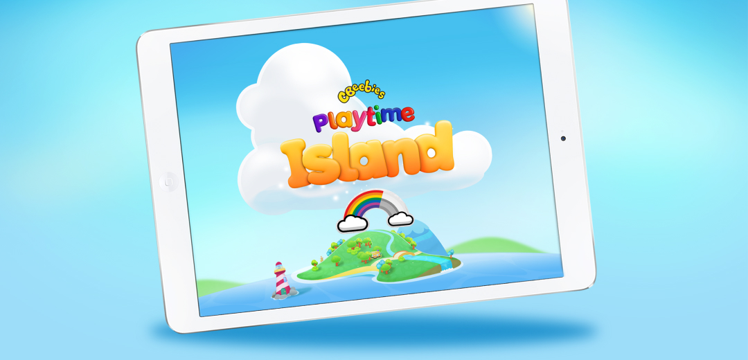
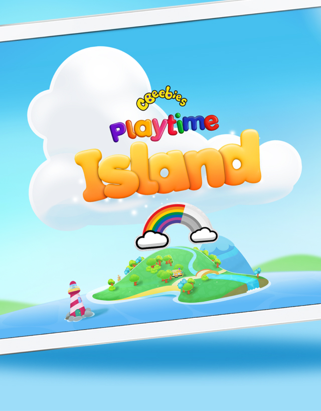
BBC

Playtime Island

A simply amazing project to lead the design of within a brilliant product team.

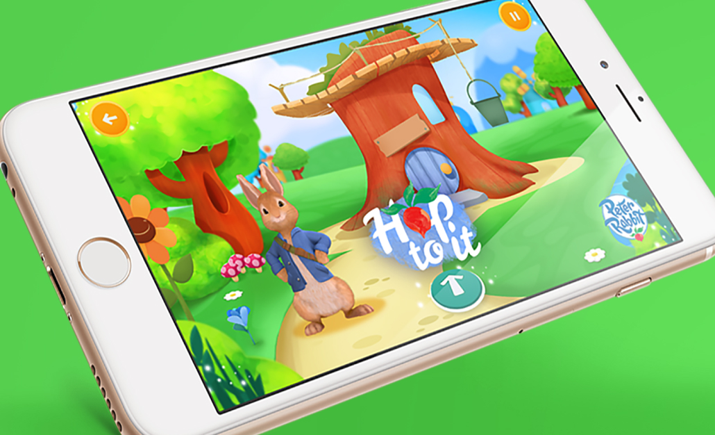
We built a new children's app designed to cut costs and filesize by housing HTML 5 games as opposed to native built-in games.

I left the BBC as the app launched to start my contracting career. An incredibly tough choice at the time as this was the project of a lifetime.

Career-wise it's one of the big regrets that I wasn't around to help see the introduction of new features and further develop the app but on the flip side, I was so lucky to work with such a great team.

The problem

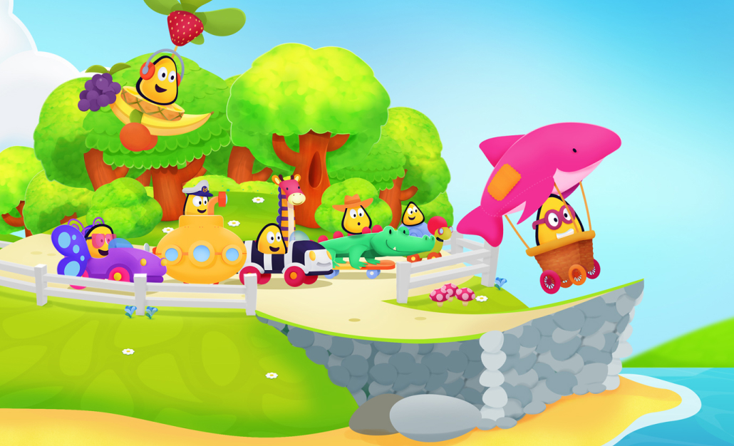
The CBeebies Playtime app has been a huge success for the BBC but the file size of the app has always been big (currently 796Mb), adding new content to keep the app fresh required a new update whilst also increasing the file size even further. The technology used also meant it wasn't accessible to screen reader users.
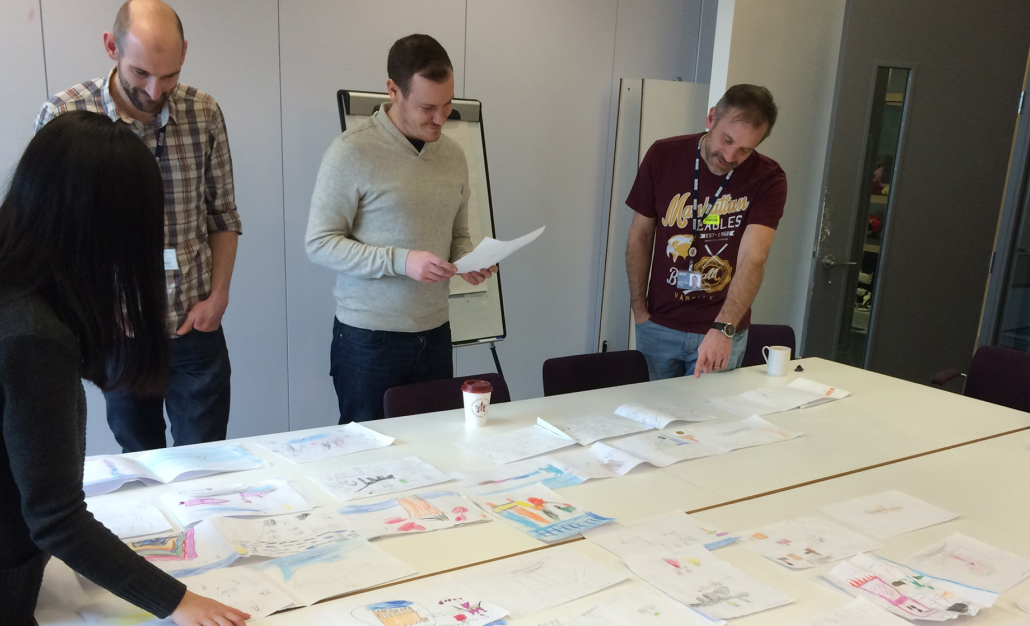
THE TEAM

Robin Gibson (Snr Designer)
Hannah Magowan (Mid Designer)

MY ROLE

I worked from concept and discovery to finished product

Strategy

Team lead

UX Design

UI Design

Illustration

Character animation

TIMELINE

August 2015
September 2016

LINKS

Our Approach

The UX team was involved throughout the product definition phase helping to gather insights alongside the BAs.

All the data and evidence from Playtime showed that the strategy of a single purpose gaming app with multiple games was incredibly successful but making games is expensive, the retention of games can be quite low.

The product team spotted an opportunity to reuse existing HTML5 games within an app wrapper. This would allow us to essentially halve the cost of game production, one game for both the web and app. It also meant the new product could be built to be accessible to users with additional needs.

At the same time as our discovery phase, I was rewriting Games GEL to ensure greater consistency between games. The importance of Games GEL can't be understated, it meant if we brought our games together in one app, users wouldn't experience jarring switches in UI or face having to learn new ways to access the content.

We created a series of simple animations to illustrate the problems to stakeholders we were trying to solve.
This is the initial concept sketch for the whole idea of Playtime Island.

The next challenge was how to deliver new content within the app regularly to our audience. The stats from the CBeebies Storytime app showed how successful the introduction of a download feature aimed at kids had been. The retention stats and overall stickiness had been drastically improved. As a UX team, we'd done an awful lot of hard work to make a download journey simple enough for a three-year-old to use.

Our assumption was that we could reuse the same download pattern in this new app.

As a team we listed our assumptions about this new app and story mapped what we felt would be the minimum viable product to get to market. MVP can often be misunderstood but the most important word is viable, the children's market is competitive, we needed to be viable within that.

We regularly used whole team exercises such as Rose/Bud/Thorn to help during ideation.
After the co-creation sessions with the children we'd dot vote our favourite concepts.

With this in mind, I was aware we needed a strong narrative and a set of design principles to hook the whole menu together. We worked closely with editorial to agree on the design principles before ideating on different themes.

We then presented four ideas back to the product team. The overwhelming favourite was for a town narrative therefore each game would be represented by a building. We created lots of prototypes with different interaction methods to test with users whilst simultaneously creating some initial concept art to elicit the feel of the app. Children's prototypes generally need to be much richer to hold their interest.

I was really keen to involve children in the design of the app, further than simply in user testing. I wanted to get their thoughts and ideas into the app.

We set about organising school visits where we got classes to help draw where their favourite characters could live and how they might travel around the town.

These sessions were brilliant fun and now form the basis of all future design work. We get the kids ideas first and try to develop them into something usable. At the same time, we ran workshops with the product team to help form our hypothesis on the different features of the app and how we might test them.

On the surface, it can be easy to dismiss Playtime Island as just a children's app, but the product thinking, research, strategy and ideation sessions make this a standout project for the way the team adopted new ways of working.

The MVP is due for launch in September.

Gallery

THE TEAM

Robin Gibson (Snr Designer)
Hannah Magowan (Mid Designer)

MY ROLE

I worked from concept and discovery to finished product

Strategy

Team lead

UX Design

UI Design

Illustration

Character animation

TIMELINE

August 2015
September 2016

LINKS