SUMMIZE

Launching a startup

A small team with a big idea. I've loved watching Summize grow and grow.

I met Tom, the founder of Summize, whilst I was contracting at Zuto and he was working as their in-house lawyer. We got on well and he showed me a very ropey looking prototype that he and Dave had made. It looked completely unusable, yet the idea behind it was brilliant. Upload a contract and it will instantly give you a summary of the key points. Even better you could upload hundreds in one go and compare the key-points immediately.

The problem

I was instantly struck by the idea and told Tom that if he ever needed any design help he should give me a shout. 6 months later he got in contact. We worked out an arrangement were I would help get the design off the ground to show investors without costing him an arm and a leg.

The challenge I faced is I didn't understand the slightest thing about legal and the terminology was extremely complex. Just understanding what Tom's prototype was doing was tricky enough but my aspiration was that although the contents might be complex the system itself should be as intuitive to a non-lawyer as an actual lawyer.

THE TEAM

Robin Gibson (Snr Designer)
Tom Dunlop (Lawyer and founder)
Dave Smith (Dev and founder)
Andy Isherwood (Tech lead)
Rich Somerfield (CTO)
Veronica Harradence (Junior Dev)

MY ROLE

I worked from discovery to finished product

Strategy

UX Design

UI Design

Research

TIMELINE

February 2018
January 2019

LINKS

Our Approach

I pulled apart Tom and Dave's prototype and tried to put it back together as a series of clickable wireframes.

This approach helped me a lot. Tom was a lawyer and his idea had come from his own frustrations. As a user this gave me lots of insight and I rapidly iterated on the wires until the flow felt quick, simple, easy and understandable.

Some early wireframes created at the beginning of the project.

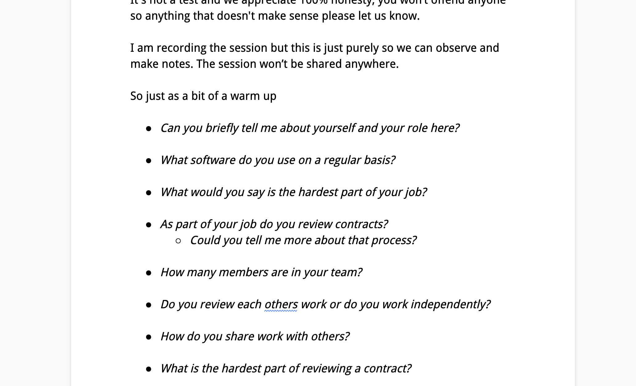
Tom knew some legal firms who would be willing to help me out with user research. I drafted some research objectives and open questions and ran these past Tom to check I was on the right track. I got my laptop, cameras and microphone and headed to the offices to interview eight lawyers.

The first parts of the session were open questions, probing around the challenges they face day to day in dealing with contracts. It was incredibly insightful (user research always is) but I had so little idea of how lawyers and legal firms operate that it felt even more powerful.

For the second part of the session I showed them a clickable prototype and asked them to complete a series of realistic tasks. Remarkably, the prototype hung together well giving us clear direction on what worked and didn't work with regards to flows. It was clear from the sessions that some features wouldn't be used whilst others needed dialling up in prominence.

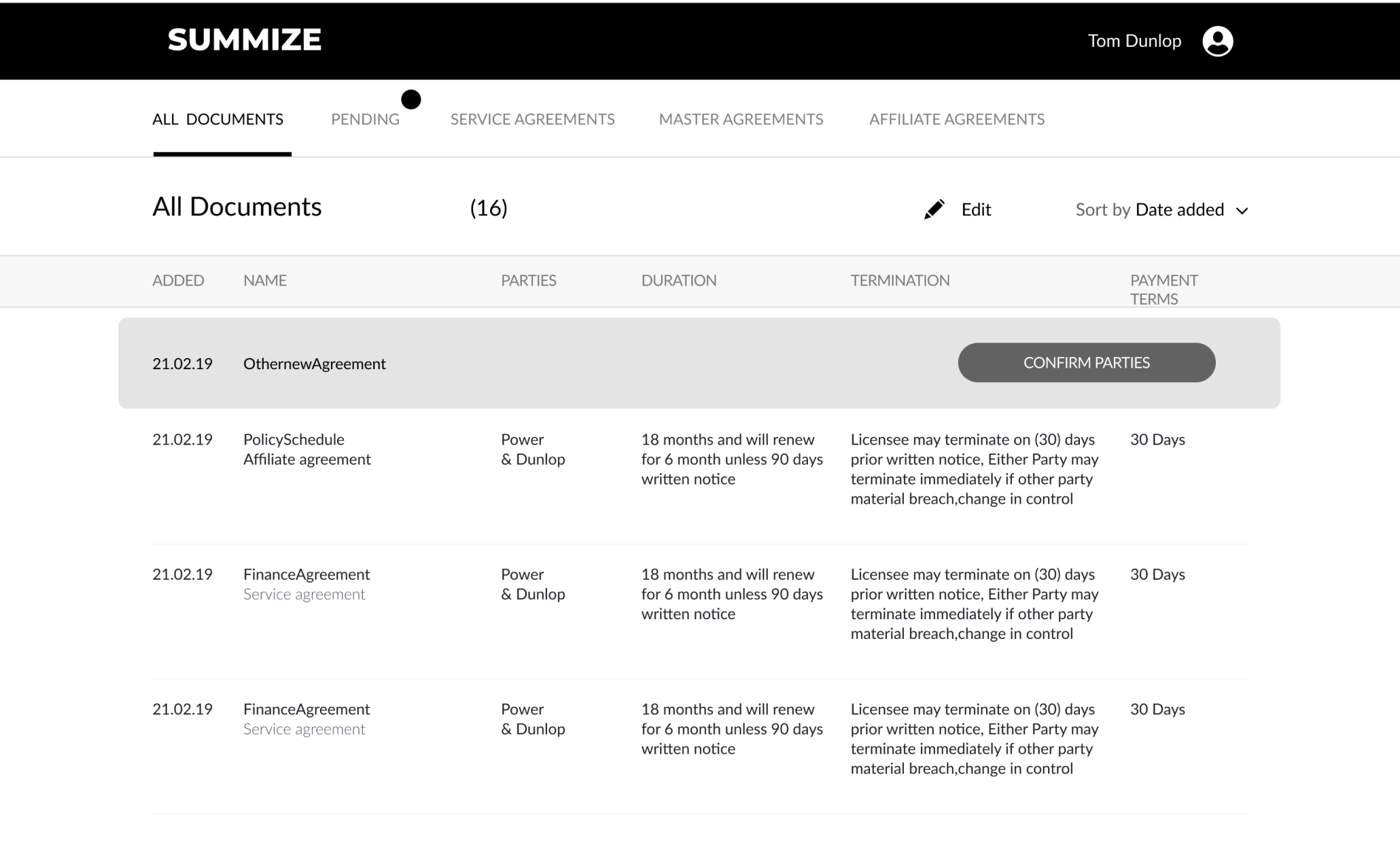
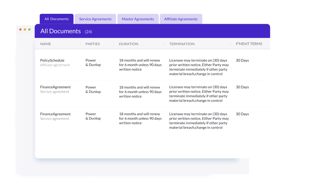
The table view enables users to compare key clauses within contracts.

Working in a startup isn't straightforward; you need to wear many hats. At the same time as trying to work out the UX and conduct the research I had to work out the branding and marketing assets.

The biggest constraint was always time. I was working in my evenings to get through the work and had to come to terms that my design decisions weren't cast in stone, we could revisit. It was more important to move fast and cover a lot of ground, I could tweak the branding later, revisit a layout, iterate a flow.

Tom and Dave were working all hours to build relationships, architect the software. I would take half an afternoon off here and there to go meet lawyers, test prototypes, gather more research. It was a really exciting time and it really was never clear how it would all end up.

Tom was able to secure funding which enabled him and Dave to go full time. They started to hire some developers to help take the load off Dave. I recommended my good friend Andy Isherwood, a true full stack dev. We'd worked together at the BBC on Playtime Island and he is simply the best all rounder I've worked with.

Things really started to ramp up for me, I needed to supply designs for development to build whilst I was still working out the visual design of the software. I'd work a full day, go home and spend time with my children before sitting down in front of my laptop to start designing layouts for four hungry developers.

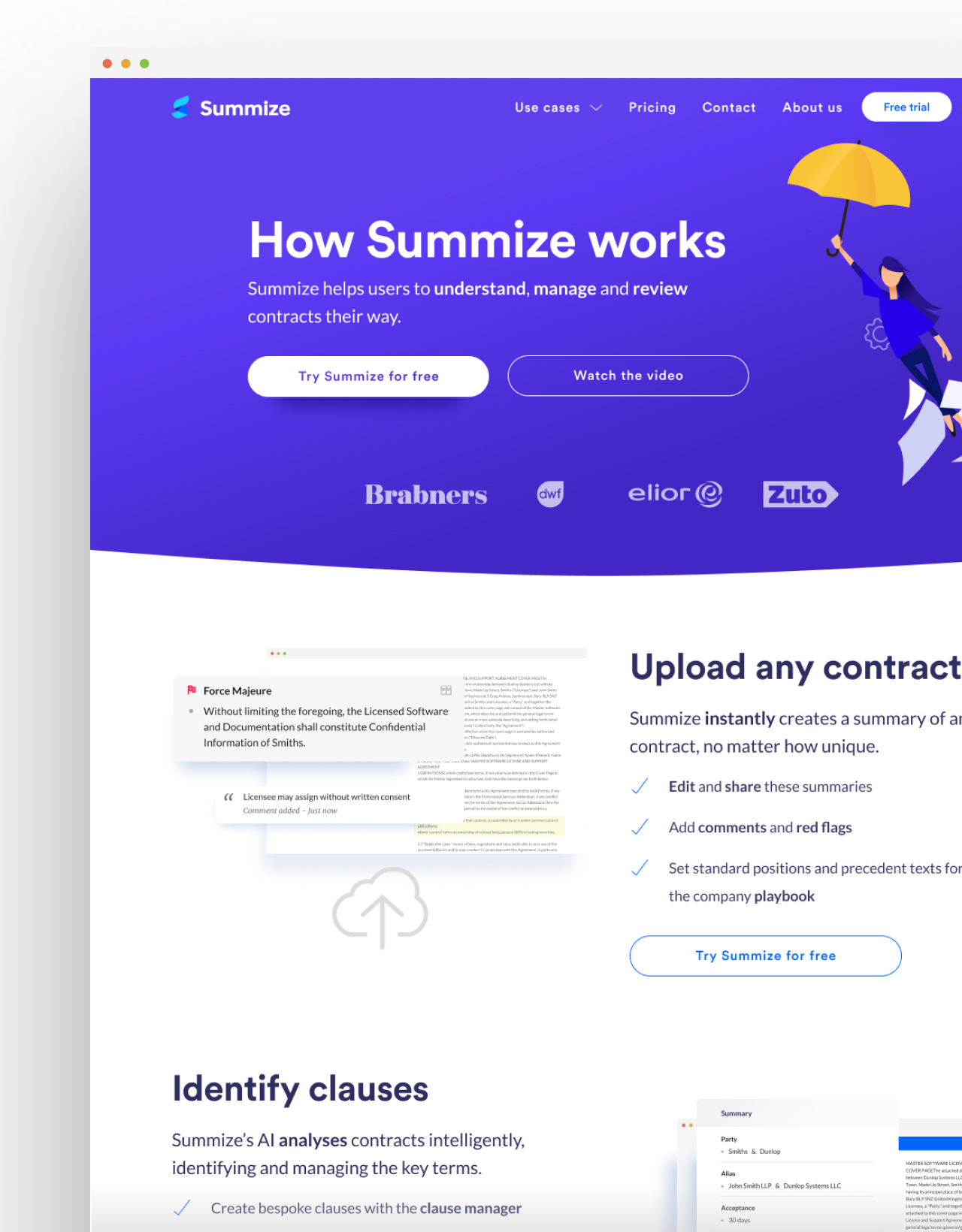
Summize is now established with a large amount of customers, a brand new city centre office and a team that's growing and growing.

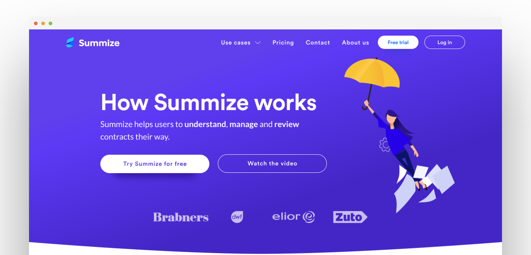
I created a set of illustrations that the marketing team could use to promote the product.

And it's brilliant to see. They hired really, really well. Rich Somerfield came in as CTO and was utterly brilliant. His approach as CTO is the best I've seen. Zoe came and drove the marketing from a couple of visits to the site a month to the thousands they are getting now. In Andy they had the best all rounder you could get.

It shows the power of a team, and when you get the balance just right, it shows what can be achieved.

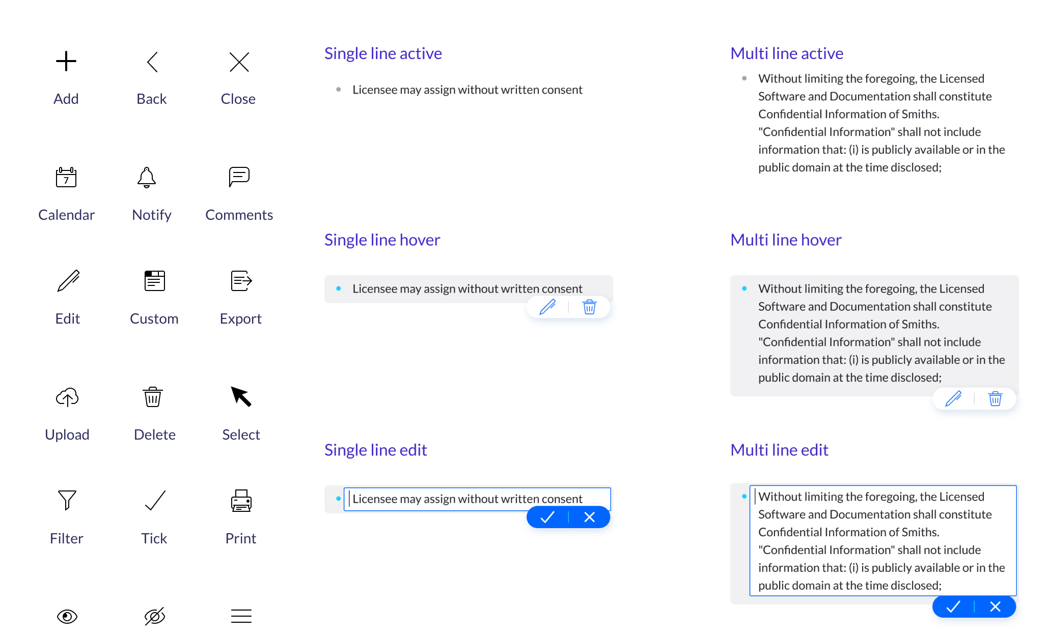
I created a design system in Figma to support development.
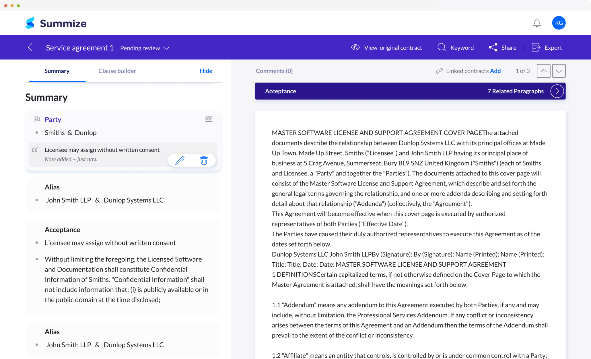
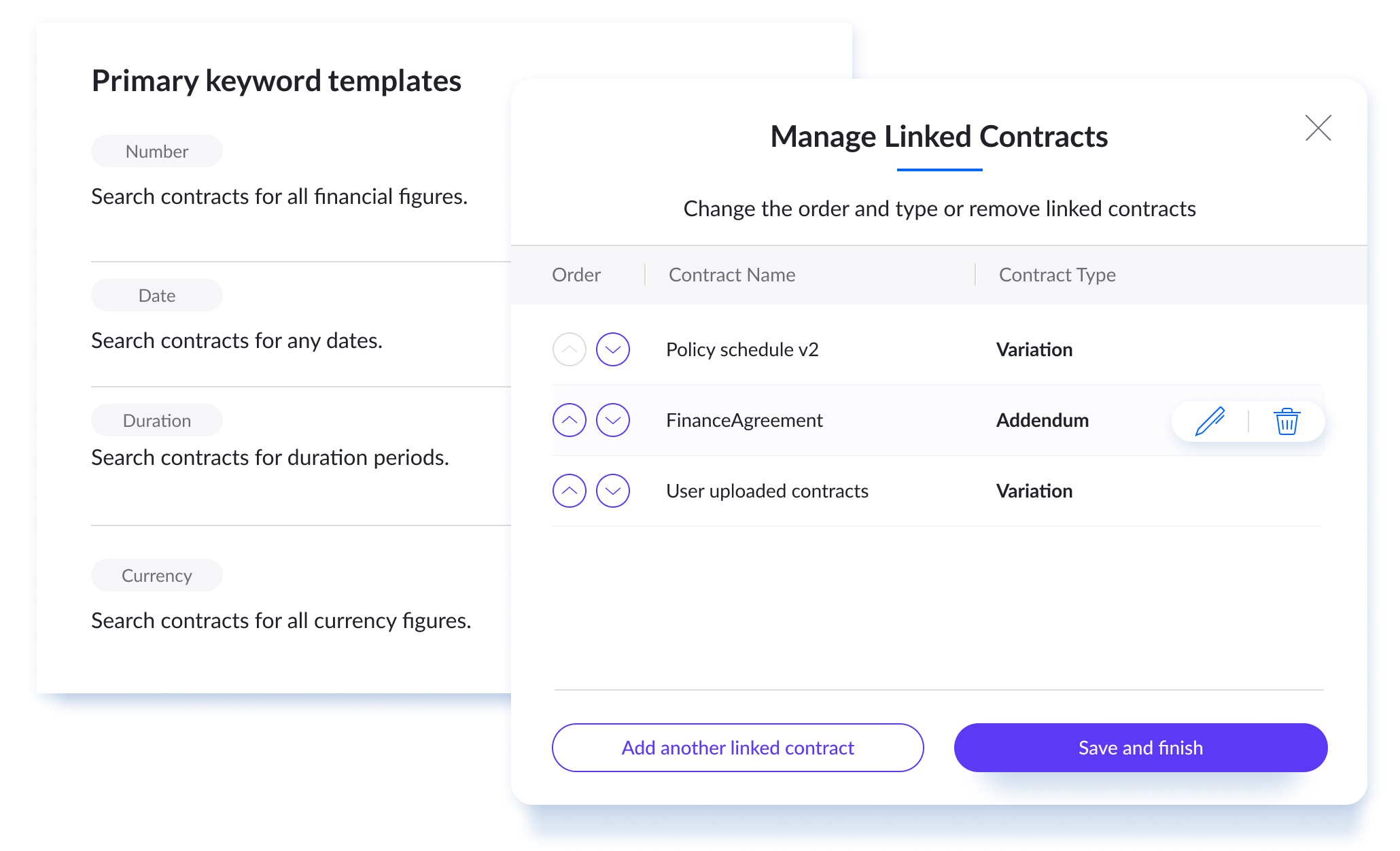
Some features were powerful but could be complex, we iterated until we could make them intuitive.

As for myself, I've got a vested interest in Summize but handed the design work over to Homan once it got to a stage were I couldn't support the size of the team anymore part-time. Homan's been great since he joined and we have regular catchups in a mentorship capacity.

I'm super proud, that with the team, I was able to help take something from nothing to a £5,000,000 valuation.

THE TEAM

Robin Gibson (Snr Designer)
Tom Dunlop (Lawyer and founder)
Dave Smith (Dev and founder)
Andy Isherwood (Tech lead)
Rich Somerfield (CTO)
Veronica Harradence (Junior Dev)

MY ROLE

I worked from discovery to finished product

Strategy

UX Design

UI Design

Research

TIMELINE

March 2019
October 2020

LINKS