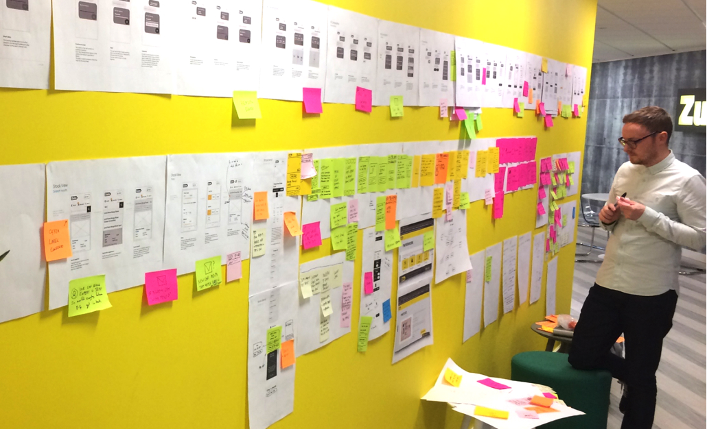
ZUTO

New digital journey

My first project as a contract designer after leaving the BBC. I joined Zuto to help them improve their user experience from the ground up.

It was an incredible opportunity but also came with its own pressures. The scope and demands of the project meant I needed another senior onboard. I looked to get Ryan involved and alongside Ellen we got to work.

The problem

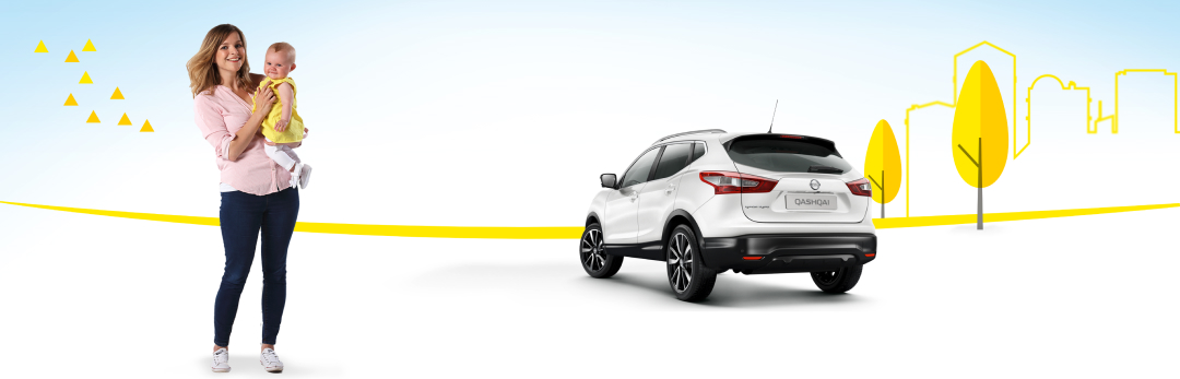
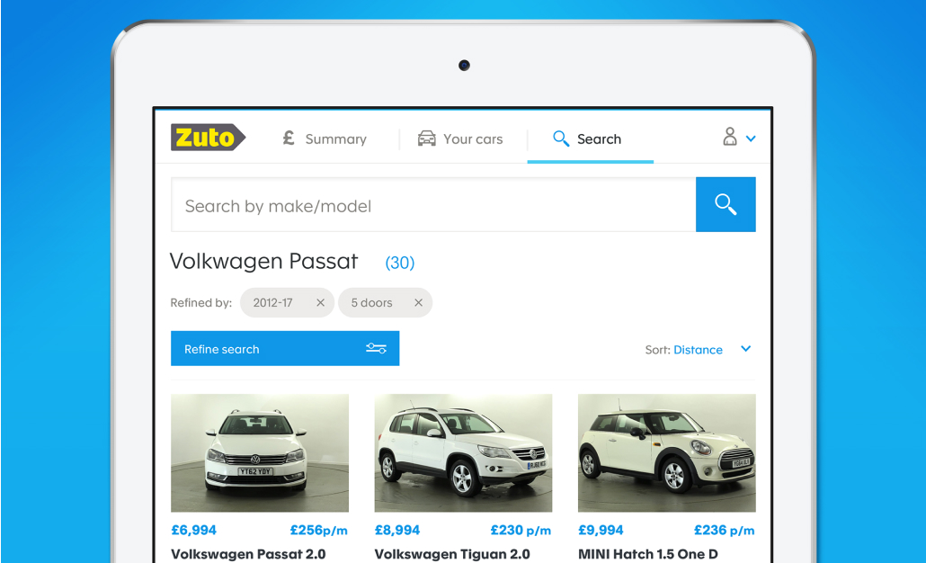
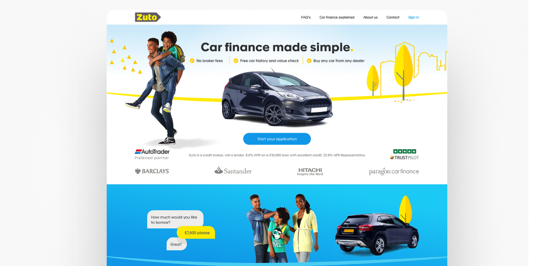
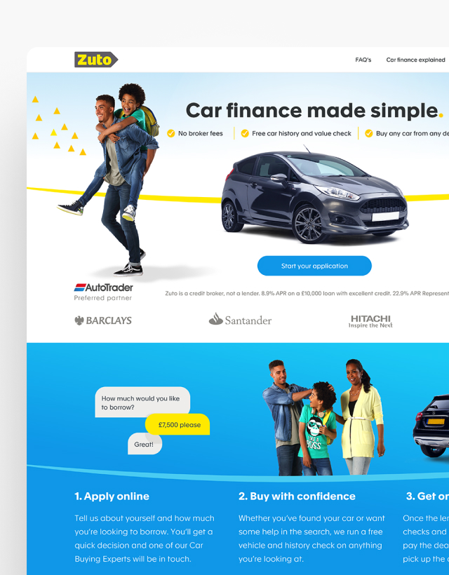
The product team at Zuto had a vision to reimagine the Car Buying Experience for consumers however they felt they had reached the end of the road with their current site. Optimisation had been done with regular A/B testing but the product team didn't feel they were seeing significant enough improvements for a company with huge ambitions. There was also a nagging concern that their brash and bold art direction may be putting some customers off from a great car buying experience.
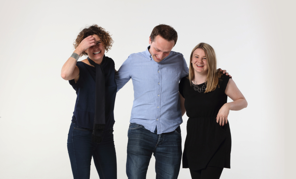
THE TEAM

Robin Gibson (Acting Head of UX/Snr Designer)
Ryan Hussey (Snr Designer)
Ellen Setterfield (Junior Designer)

MY ROLE

I worked from concept and discovery to finished product

Strategy

Team lead

UX Design

UI Design

Illustration

TIMELINE

September 2016
February 2018

LINKS

Our Approach

My first task at Zuto was to find all the existing research I could get my hands on and pull it all together.

Luckily Zuto had previously commissioned an in-depth study on car buying as well as some focus group work on the existing site.
Based on this research myself and Ellen rapidly pulled together some Light Weight personas. We intended to continually revisit them during the design process but as an initial compass on the needs of our customers they did the trick.

Armed with these personas we conducted a series of workshops with stakeholders, product and development to identify facts/assumptions and to create a simple story map that would enable a customer to complete the tasks we believed they needed to complete to achieve their goal.

We created a design system from the ground up with a few brilliant devs
I really felt the pressure on the photoshoot, we had one chance to get it right, luckily Pip was amazing (photos by Pip Rustage)

The next layer of the workshop was to overlay an experience map over the story map to identify where we felt the pain points where most likely to be.

This process helped us rapidly decide which features we felt would be the most important to our personas and gave us a wire or schematic view of what an MVP might look like.

Of course, we hadn't tested this MVP yet or done any actual prototype work so ideas at this point where simply our best guesses or assumptions but we were comfortable with the idea that we could revisit these after every round of user research.

We collated our hypothesis into a spreadsheet and looked at the lightest way we could validate these. Sometimes we already had the answer in our data or from reports commissioned by the marketing team. Other times we needed to find other ways to validate, the most common being our use of lab research.As with any commercial business I’m unable to discuss specifics of the project but I can briefly talk about some of the areas we identified.

One of our key hypothesis involved making an application for car finance more like a conversation. We believed that by doing this we would lower drop off from users completing the application form.

It was a big bet feature so we looked at lab research to test the hypothesis.
By this point I’d managed to get us an extra pair of design hands, the brilliant Ryan Hussey (now at IDEO) to help us with the huge volume of design work.

We tested two types of interaction a more standard form and the conversational style form. The conversation tested extremely well as did our redesigned standard form, but we felt the benefits of the conversational form slightly outweighed the more standard form.
We ran extensive sessions over the application form, finding problems such as the edit function not being clear or the progress bar being missed.

Each round enabled us to hone the design down into what's there today. As part of the design work, we looked at the issues of the previous design.

Yellow, although key to the brand, was overpowering and the all caps and chunky font reduced legibility.

The imagery used throughout the site was also limiting with research showing that there simply wasn’t enough cars on the site for customers to get excited about. We wanted to lighten the whole feel of the brand and tie into our key design principles of simplicity and transparency so we peeled back every layer and readdressed the colour palette, introducing a rich blue for “Calls to actions”.

The font took a few iterations to get right but we settled on Apax, a clean Sans Serif font that had a large number of weights and cleaner numerics than the previous Alright Sans font.

I was keen to keep the imagery simple and clean again, to highlight the transparent nature of the company whilst retaining a friendly approach feel.

In the end, we adopted a simple illustrative style for the background before using cut out cars and people to sit in the foreground. This would mean design and marketing would have much greater freedom in composing appropriate imagery. This style combined with the font seemed to work well but our use of stock imagery was bringing the work down.

I arranged for the brilliant Pip Rustage, an awesome Manchester-based photographer, to arrange a photoshoot for us. In it, we would take new shots of cars and models. The experience was brilliant and the photos we got back where amazing, bringing the pages to life.

Working with the development team I was able to help them translate our Sketch files and static designs into reusable code and components to build the site from. This formed part of a live style guide which means that any changes to parts of the design should roll out across the rest of the site. You can read more about that here.

An amazing company The Zuto team are an amazing bunch of people and their desire to innovate was second to none. They gave me the freedom to introduce more qualitative testing to back up the quantitive whilst also allowing me to introduce a competency framework for designers.

This helped us to hire the permanent design team they have in place now. The whole project was an incredible journey and I'm thankful for the opportunity, there were challenges of course but in the end, I'm proud of us as a team with the resources we had and the level of change we introduced.

THE TEAM

Robin Gibson (Acting Head of UX/Snr Designer)
Ryan Hussey (Snr Designer)
Ellen Setterfield (Junior Designer)

MY ROLE

I worked from concept and discovery to finished product

Strategy

Team lead

UX Design

UI Design

Illustration

TIMELINE

September 2016
February 2018

LINKS